Xaier
n3wBi3
 "I guess my luck just ran out.."
Posts: 47
|
Post by Xaier on Jun 29, 2008 19:26:13 GMT -5
 This is basically a crappy drawing of my GANTZ character. Kasaru Sagara. I know i's not perfectly accurate, but it's my first time drawing anyone in a gantz suit, and I'm just starting to draw again. Who knows, maybe I'll do more.  ------------------------------ I drew it on a piece of paper, took a picture of it with my shitty cellphone camera, and then put it through photo shop and did the line art. First time doing line art as well. So it doesn't match exactly with the pencil drawing. Ah well. Cloe enough. |
|
|
|
Post by jjrev609 on Jun 29, 2008 19:53:53 GMT -5
eyes
|
|
|
|
Post by KßзŁŁ on Jun 30, 2008 10:01:41 GMT -5
not bad man
|
|
Xaier
n3wBi3
"I guess my luck just ran out.."
Posts: 47
|
Post by Xaier on Jul 1, 2008 0:12:34 GMT -5
 Got my tablet. Think this looks any better? |
|
|
|
Post by jjrev609 on Jul 1, 2008 0:34:33 GMT -5
i could do sum serious critiquing but all in all it looks pretty good since u fixed the most outstanding defect i saw in the first one
|
|
Xaier
n3wBi3
"I guess my luck just ran out.."
Posts: 47
|
Post by Xaier on Jul 7, 2008 22:37:25 GMT -5
 Was messing around with my tablet at a friends last night. This is what I drew for 'em. Possibly part of a little project we might try and pick up. |
|
|
|
Post by jjrev609 on Jul 8, 2008 0:01:37 GMT -5
ok let me start with sayin art is my career major in school and seeing ur art is kinda rubbing me the wrong way, not that it's bad but there are outstanding errors that I'm not sure you see. I'll just tell you a few of the things that are kinda upsetting me.
First is the hairline and the sideburns. They should not connect like that. It makes it seem as if his head is more flat. If that shine spot is supposed to define his bangs then that must mean this guy's face is not as wide as the picture wants you to think.
Second is the ears. By the point of view you've chosen normally you shouldn't be able to see the details in the ear that you would see from the side, unless this guy has some Dumbo ears. The ears should be against he side of the head, not fanned out like they are.
Third is the nose. It looks like it was mushed in and smeared to the left side of his face, but you might have meant for the line to just define one side of his nose. If that were the case then you should have put another line on the other side to help the person looking realize that's only a side of the nose, the line doesn't have to be big but big enough to help shape it into a nose.
Fourth is the neck. Although not so bad the neck shouldn't immediately fan out from under the chin. it should go straight first then fan out about the middle of or close to 3/4 down the Adam's apple. The lines that show the collarbone and the sides of the throat (I think that's what those parts are) are low, bring them up more because to me it seems like the spaces where his collarbone sticks out from the neck to form the shoulders would be huge.
Overall the guy seems flat to me because of the way you've drawn some parts and the shading. Work on these things and I'm sure you'll make better pictures. Like I said before it's not that it's bad, it's pretty good actually, I'm just tryin to help you out.
|
|
|
|
Post by KßзŁŁ on Jul 8, 2008 0:33:06 GMT -5
I thought the drawings were pretty good.
|
|
|
|
Post by Dane on Jul 8, 2008 6:44:45 GMT -5
Wow... finally me and JPimpin agree on something lol
But seriously, the drawings are good, but not as good as they ultimately could be. Though, the only real discrepancy I have with the third one is the ears. That just bugs the hell out of me. Everything else, (Neck width, hairline, etc) can really be chalked up to your own art style.
Like, my personal art style has the bottom and top of the eyes connected, heavier shading, more detail in the hair etc, but to each his own, right?
Anyway, I don't have any complaints about the first picture, personally, I think that's the best of the three by far. The second one just seems weird to me. Mostly because the neck is too long, though that's only in comparison to the first.. Then, the eyes are too close together, ears are fanned out, and the bit that connects the shoulder and the neck seems the muscular compared to what we see of the rest of the body.
On a funny note, the whole make-up of the face in the second picture makes me think of a monkey lol
|
|
Xaier
n3wBi3
"I guess my luck just ran out.."
Posts: 47
|
Post by Xaier on Jul 8, 2008 14:39:37 GMT -5
ok let me start with sayin art is my career major in school and seeing ur art is kinda rubbing me the wrong way, not that it's bad but there are outstanding errors that I'm not sure you see. I'll just tell you a few of the things that are kinda upsetting me. First is the hairline and the sideburns. They should not connect like that. It makes it seem as if his head is more flat. If that shine spot is supposed to define his bangs then that must mean this guy's face is not as wide as the picture wants you to think. Second is the ears. By the point of view you've chosen normally you shouldn't be able to see the details in the ear that you would see from the side, unless this guy has some Dumbo ears. The ears should be against he side of the head, not fanned out like they are. Third is the nose. It looks like it was mushed in and smeared to the left side of his face, but you might have meant for the line to just define one side of his nose. If that were the case then you should have put another line on the other side to help the person looking realize that's only a side of the nose, the line doesn't have to be big but big enough to help shape it into a nose. Fourth is the neck. Although not so bad the neck shouldn't immediately fan out from under the chin. it should go straight first then fan out about the middle of or close to 3/4 down the Adam's apple. The lines that show the collarbone and the sides of the throat (I think that's what those parts are) are low, bring them up more because to me it seems like the spaces where his collarbone sticks out from the neck to form the shoulders would be huge. Overall the guy seems flat to me because of the way you've drawn some parts and the shading. Work on these things and I'm sure you'll make better pictures. Like I said before it's not that it's bad, it's pretty good actually, I'm just tryin to help you out. It's cool. I won't take anything bad away from that. I'm glad you're actually commenting. I know I need to work on a lot of that stuff, which is what I've been trying to do. Shading is probably going to be the hardest thing for me. I'll keep all that in mind. Thank guys. |
|
|
|
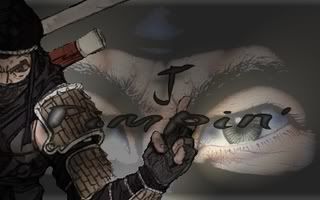
Post by Dane on Jul 8, 2008 19:47:48 GMT -5
Welp, in the spirit of things, I felt like drawin' a Gantz picture and puttin' it one here cuz it actually would be nice to have a bit of critique. An' wouldn't ya know it? It's Katou-Cha(LOL)!!  Oh wow... that's a bit big, innit? Sorry about that, my computer (or me possibly) is retarded. |
|
Xaier
n3wBi3
"I guess my luck just ran out.."
Posts: 47
|
Post by Xaier on Jul 10, 2008 2:27:01 GMT -5
 Drew this earlier today. A character for something a friend and I plan on doing. |
|
|
|
Post by Benry on Jul 10, 2008 7:18:37 GMT -5
cool it seems like u took some of jpimpin's suggestions and used them in ur last piece. The pics are good, well i am comparing them to my drawings (which i suck)
You have a tablet right? Damn i wish i had one too...
Dane... well i didnt know u could draw that well. Pretty good job, and americanized version of katou lol
|
|
Xaier
n3wBi3
"I guess my luck just ran out.."
Posts: 47
|
Post by Xaier on Jul 10, 2008 13:18:56 GMT -5
I think I paid around $69 for the tablet. It' one of the smaller ones. I like it so far. A lot easier for me to draw right onto the computer. I don't like using a scanner.
|
|
|
|
Post by Benry on Jul 12, 2008 17:47:20 GMT -5
well this is something i havent finished yet, i cant decide on what color to put the jacket, any ideas guys? BTW i should warn u, this picture contains nudity(there are boobs showing) so if you dont wanna see it then dont click the link... img390.imageshack.us/img390/8376/wsoo0.jpg |
|
|
|
Post by jjrev609 on Jul 12, 2008 21:01:09 GMT -5
i say u should stick with the red but make it a darker shade and make sure you do the shading right
|
|
|
|
Post by Benry on Jul 13, 2008 6:17:18 GMT -5
aye aye captain.
|
|
Xaier
n3wBi3
"I guess my luck just ran out.."
Posts: 47
|
Post by Xaier on Jul 13, 2008 11:46:29 GMT -5
|
|
|
|
Post by Dane on Jul 13, 2008 11:48:22 GMT -5
Ooh... I really like this one. Look at you, you rebel. You don't play by the rules do you? lol
|
|
XenoD
b47713-w0rN g4n7z3r
 1st of a New Wave
"Ugh"
1st of a New Wave
"Ugh"
Posts: 459
|
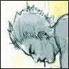
Post by XenoD on Jul 13, 2008 12:03:06 GMT -5
Those eyes...they scream.
|
|
|
|
Post by jjrev609 on Jul 13, 2008 14:14:16 GMT -5
pupils are kinda small but for the most part YOU LISTENED TO US YAYES!!! xD
|
|
Xaier
n3wBi3
"I guess my luck just ran out.."
Posts: 47
|
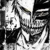
Post by Xaier on Jul 13, 2008 16:33:45 GMT -5
|
|
Kramarr
d3c3n7 g4n7z3r
Third-Timer
"The Undead"
Posts: 223
|
Post by Kramarr on Aug 7, 2008 1:26:23 GMT -5
I like the last one the most...good stuff.
|
|